






When you think of Italian design, a few names come to mind right away: Achille Castiglioni, Gio Ponti, Ettore Sottsass.
And within that constellation is a Milanese artist with a sharp sense of humor, a taste for the absurd, and more than 13,000 cataloged works: Piero Fornasetti.
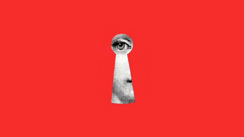
You may have seen one of his plates without even knowing it. A woman’s face transformed into a sun, a mask, a mermaid, a clown.
A cabinet that pretends to be the façade of a palace. Wallpaper that covers an entire hotel lobby with stylized clouds.
The name Piero Fornasetti may not come to mind immediately, but his aesthetic already appears in many high-end projects around the world.
In this article, you will discover who Piero Fornasetti was, the logic behind the style he created, and how the most famous series of his career was born. By the end, you will also understand how to bring this universe directly into your Revit projects.
Let ‘s get started. Enjoy the read!
Quem foi Piero Fornasetti?
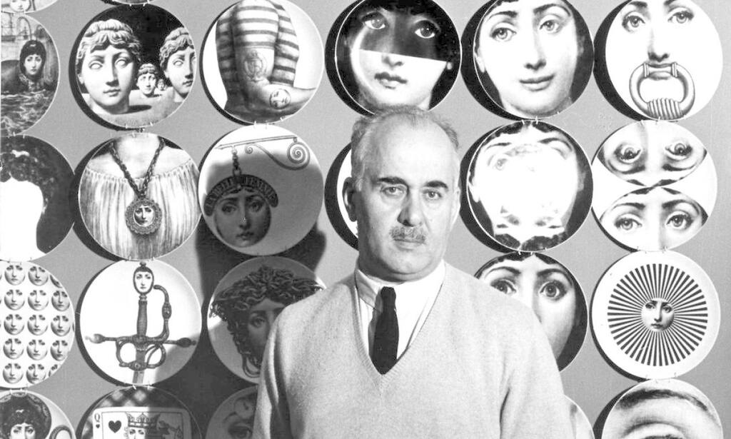
Piero Fornasetti was born in Milan on November 10, 1913, and died in the same city on October 15, 1988.
Over his 75 years of life, he was a painter, sculptor, illustrator, engraver, furniture designer, interior decorator, and the founder of an atelier that remains active today under the direction of his son, Barnaba Fornasetti.
According to the official atelier, Piero Fornasetti’s body of work includes more than 13,000 cataloged objects.
In 1932, while still young, Piero Fornasetti was expelled from the Accademia di Belle Arti di Brera for indiscipline.
Instead of accepting defeat, he changed schools and went on to study at the Scuola Superiore d’Arte del Castello Sforzesco, also in Milan.
His personal life followed the same pattern of someone who refused to conform. When World War II broke out, he moved to Switzerland to escape fascist military service and returned only after the conflict ended.
The atelier that bears his name was founded in 1940 in Milan and has since operated as a home, museum, workshop, and meeting place.
It was from there that the visual vocabulary emerged that would make Piero Fornasetti one of the most recognizable voices in 20th-century Italian design.
The Fornasetti style: surrealism, neoclassicism, and repetition
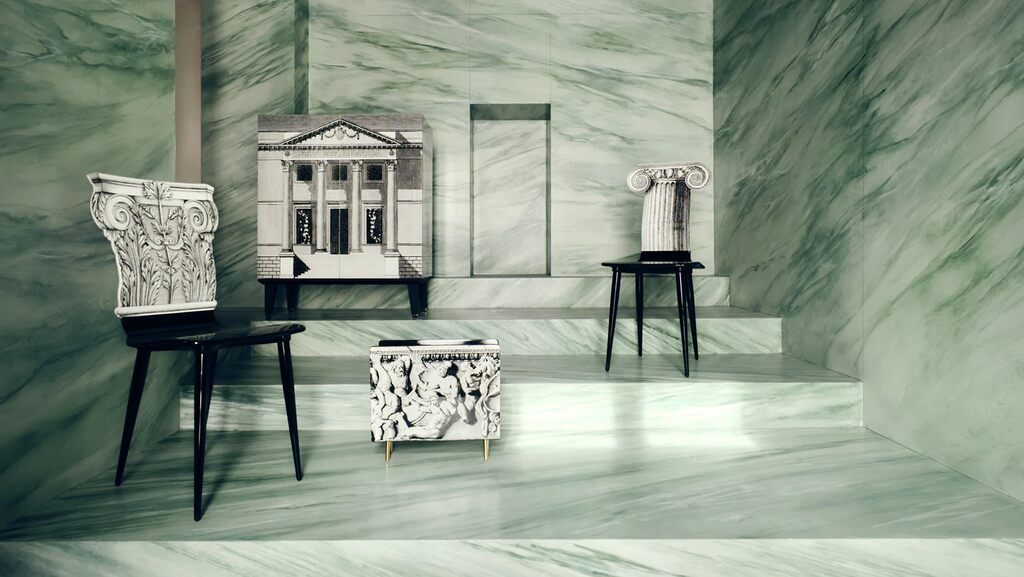
How do you describe Piero Fornasetti’s style in just a few words? It is almost impossible. But you can summarize it like this.
He took the vocabulary of the classical past, immersed it in early 20th-century surrealism, and organized everything into a repetitive graphic language, mostly in black and white, with occasional points of color.
From Giorgio de Chirico’s Pittura Metafisica, he took a sense of strangeness. From Renaissance engravings, he learned the rigor of drawing. From Dadaism came his taste for absurd collage.
All of this passed through a filter that was entirely his own: humor. Piero Fornasetti took the past seriously enough to quote it, and lightly enough to play with it.
His preferred technique was silkscreen printing. Applied to porcelain, wood, wallpaper, glass, and furniture, it allowed him to reproduce the same drawing across hundreds of objects without losing definition.
It was art with an industrial logic, at a time when Italy was rediscovering design as a mass phenomenon.
The three-layer Fornasetti rule
If you want to train your eye to recognize a Fornasetti in half a second, think of three layers that appear in almost every piece.
The first is the classical reference. It may be a column, a portal, a soprano’s face, a playing card, or a musical instrument. It is always something from the pre-modern European repertoire.
The second is the surreal intervention. The reference never appears intact. It is cut, recombined, transformed into a mermaid, a mask, or a repeating pattern.
The third is the printing technique. The graphic black and white, the engraved line, the silkscreen application. This is what ties everything together and gives the work its visual unity.
The next time you come across a piece that looks suspiciously Fornasetti in an Italian café, an antiques shop , or an interior design magazine, try this mental test. If the three layers are there, you are looking at something from the Fornasetti universe.
Tema e Variações: o rosto que virou ícone
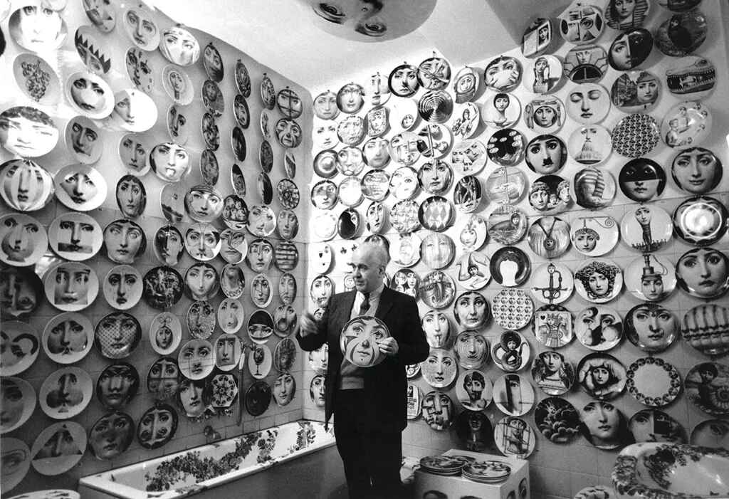
No project sums up Piero Fornasetti ‘s creative obsession better than the Tema e Variazioni series.
It all began with a photograph he found by chance in a French magazine from the early 20th century.
The face belonged to Italian soprano Lina Cavalieri, known at the time as one of the most beautiful women in the world. Piero Fornasetti cut out that face and turned it into the foundation for more than 350 variations throughout his life.
In each piece, Lina appears in a different way. As a mermaid, a sun, a Venetian mask, blindfolded, with hair turned into flames, or with a large mouth and tiger teeth.
One version is funny, another is melancholic, and a third looks like something printed on a horror movie poster. The overall effect is hypnotic.
The series connects with what Andy Warhol would later do with Marilyn Monroe. The difference is that Piero Fornasetti started earlier and took the exercise to a level of obsession American pop art never attempted.
Today, the Tema e Variazioni plates are the most recognizable item from the house of Fornasetti. They are present in important museum collections, such as the Victoria and Albert Museum in London, and in high-end residential projects around the world.
There is something deeply contemporary about this idea: repeating, distorting, recycling, and still preserving a visual identity. That is exactly what many contemporary designers do today, and Piero Fornasetti did it first.
The partnership with Gio Ponti
To understand Piero Fornasetti’s place in Italian design, we need to talk about Gio Ponti, one of the most influential architects of the 20th century and the founder of Domus magazine.
The two met in the late 1930s and began one of the most productive partnerships in modern design.
The highlight of that collaboration was the ocean liner Andrea Doria, launched in 1952.
Piero Fornasetti decorated entire interiors of the ship with trompe-l’œil paintings and panels, while Gio Ponti was responsible for the architecture.
When the Andrea Doria sank in 1956, a significant part of that heritage ended up at the bottom of the Atlantic. Even so, the partnership between the two left its mark on other important projects.
They worked together on the Casino di Sanremo, residential apartments in Milan, and a series of furniture pieces with graphic decoration that would become a shared signature.
For Gio Ponti, Piero Fornasetti was the illustrator capable of transforming furniture into visual narrative. For Piero Fornasetti, Gio Ponti was the architect who gave structure to his imagination.
This partnership is one of the keys to understanding why Piero Fornasetti is taken seriously in the pantheon of Italian design, rather than simply as the creator of decorated plates.
He built technical credibility in collaboration with the most respected name in Italian architecture at the time, and that still makes a difference today.
10 Fornasetti pieces every architect should know
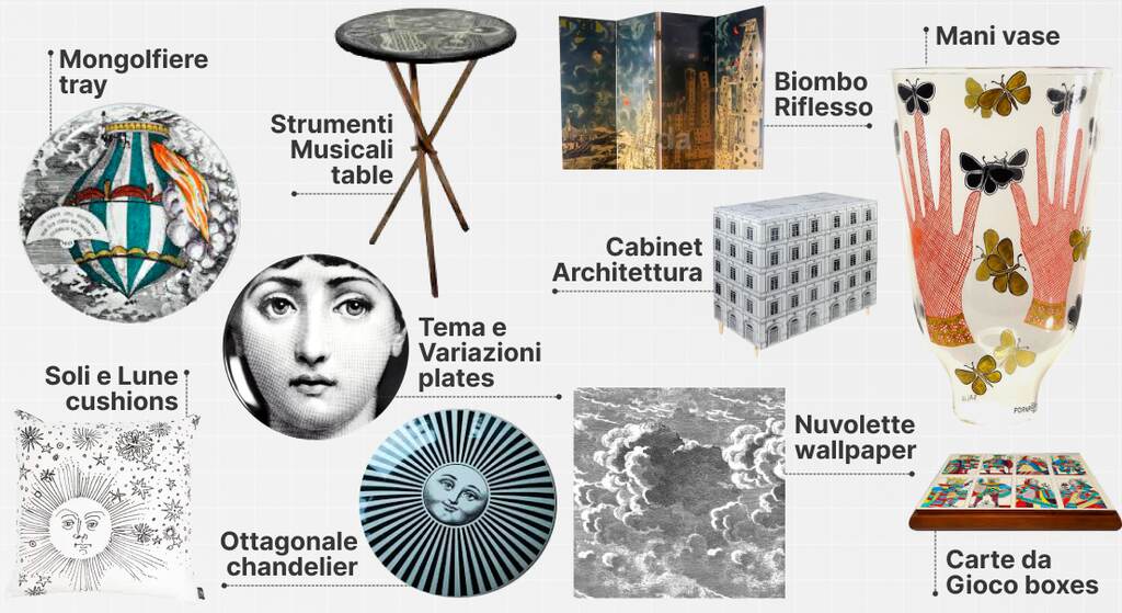
Piero Fornasetti’s body of work is so extensive that trying to know it all is an exercise in patience.
But some objects have become absolute icons in the house’s repertoire and remain in production today.
Here are ten pieces that often appear in design magazines, luxury hotels, and high-end residential interiors.
- Tema e Variazioni plates: 26 cm porcelain plates featuring Lina Cavalieri’s face in hundreds of versions. They work on walls, tablescapes, or bookshelf displays. This is the entry point into the Fornasetti universe.
- Cabinet Architettura: a cabinet with the trompe-l’œil façade of a Renaissance palace. It creates the illusion of a window with perspective, even when placed against a flat wall.
- Biombo Riflesso: a self-portrait of Piero Fornasetti in fragments that look as if they were reflected in a broken mirror. It works as a room divider or as an autonomous art piece.
- Strumenti Musicali table: a tabletop decorated with antique musical instruments, in a composition that blends the precision of engraving with the rhythm of a musical score.
- Nuvolette wallpaper: stylized black-and-white clouds that cover entire walls. It is one of the Fornasetti pieces most often used in hospitality design.
- Ottagonale chandelier: a pendant light with prisms decorated in classical iconography. There is a small version for dining rooms and a larger version for lobbies.
- Mongolfiere tray: repeating hot-air balloons. It works on a coffee table, console, or as a wall piece.
- Mani vase: a ceramic vase featuring isolated hands, creating a play between figure and ground. It is an almost sculptural tabletop item.
- Soli e Lune cushions: suns and moons in black velvet over a light background. They bring a piece of the Fornasetti universe to the sofa without overpowering neutral interiors.
- Carte da Gioco boxes: reinterpreted playing card suits. They work on shelves, side tables, or as decorative storage pieces.
This list covers a good portion of what the market today calls “Fornasetti DNA.” If you are preparing a moodboard, specifying a project, or simply training your eye, it is worth starting with these ten names before moving into the atelier’s complete universe.
FAQ: frequently asked questions about Piero Fornasetti
Do you have more questions about Piero Fornasetti? Don’t worry, below we have listed the main questions that arise about the artist and his work. Take a look!
How can you recognize an original Fornasetti?
Do you suspect that the plate in the antique shop window is a real Fornasetti? Turn it over.
An original piece usually features the “Fornasetti Milano” mark and the “Made in Italy” inscription on the back, along with the piece number and collection name.
Recent items also include an authenticity seal from the atelier.
Contemporary pieces produced under the direction of his son, Barnaba, can easily be mistaken for older Piero Fornasetti originals, since the atelier maintains the same graphic quality and standards.
The difference lies in the chronology. Pieces produced before 1988 are considered vintage and usually command higher prices at auction.
To authenticate any item safely, check the official website at fornasetti.com or consult specialized auction houses such as Wright and Sotheby’s.
Where can you find Fornasetti pieces ?
Fornasetti’s presence is strongest in Europe, but its pieces can also be found through international design retailers, curated galleries, and specialized auction platforms.
For new pieces, the official Fornasetti website is the most direct route. International platforms such as Farfetch and 1stDibs also list pieces from the house, both new and vintage.
For vintage pieces, the best path is the secondary market. Specialized auction houses, design galleries, and curated marketplaces often feature Fornasetti objects, especially iconic items such as Tema e Variazioni plates, trays, cabinets, and decorative accessories.
If you are sourcing pieces for an interior design project, always check authenticity details, shipping conditions, taxes, and import timelines before purchasing.
Who was Lina Cavalieri, and why does she appear on so many pieces?
Lina Cavalieri was an Italian soprano, born in 1874 and deceased in 1944.
Before becoming Piero Fornasetti’s muse, she was already famous in late 19th-century Europe as an opera singer and, according to critics of the time, “the most beautiful woman in the world.”
She sang in Paris, New York, and Monte Carlo, and appeared on the covers of countless illustrated magazines.
Decades later, Piero Fornasetti found a photograph of her in a French publication from the early 20th century and became hypnotized by her face.
That photograph became the foundation of the Tema e Variazioni series, which occupied Piero Fornasetti for the rest of his life and continues to be produced under Barnaba ‘s atelier.
The muse, then, is not a fictional figure. She is a real face that was adopted, decoded, and transformed into a permanent visual vocabulary.
Are there Fornasetti BIM families for Revit?
Yes, there are! Milan Design Week 2026 brought the Fornasetti universe back into the spotlight through installations, showcases, and activations that reaffirmed the atelier as one of the brands that most actively shapes the Italian design scene.
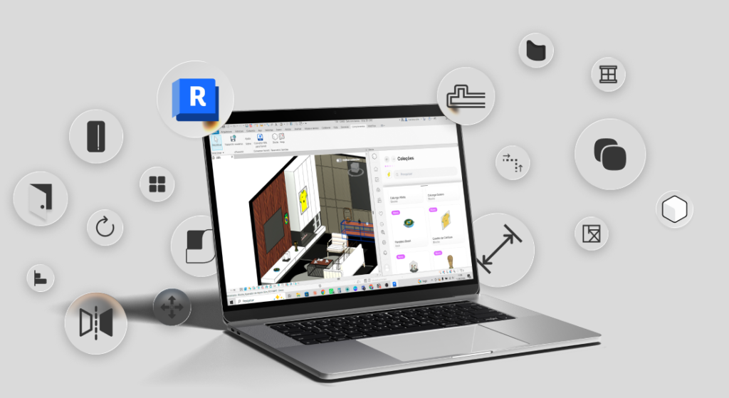
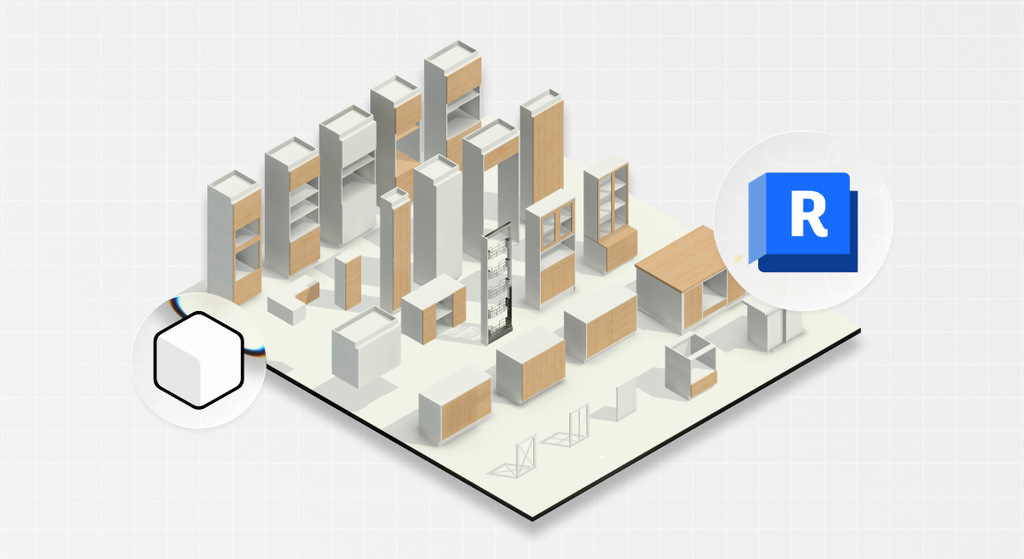
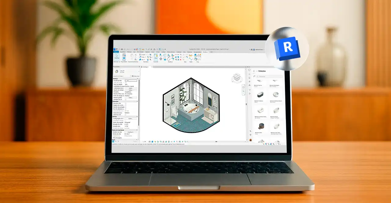
Blocks developed a collection of BIM families inspired by pieces that stood out at the event.
Each family is parametric, lightweight, configured with render-ready materials g, and ready to be inserted into your Revit model in one click.
You save modeling time, improve the visual quality of your presentation, and deliver an aesthetic your client has already seen in magazines and now wants to see in their own home.
Why wait? Download the Blocks plugin for free, open the collection inspired by Milan Design Week 2026, and bring the Fornasetti universe directly into your next project without spending an entire afternoon modeling porcelain by hand.
Conclusion
Piero Fornasetti did not copy the classics, run away from them, or treat European iconography as something that belonged only in museums.
He took that heavy, formal vocabulary and returned it to the world as everyday objects, with humor and without apology.
That is the engine behind everything the house has produced, from the plate with Lina Cavalieri’s face to the cabinet with a palace façade, from the tray with balloons to the cushion with moons.
Piero’s legacy remains alive inside the atelier led by Barnaba Fornasetti, and it continues to be rediscovered by each new generation of designers, in Brazil and beyond.
Did you enjoy this content? For more articles like this, follow the Blocks blog. And don’t forget to share this article with your friends!